When you run an ad on social media, you want it to have the greatest impact possible. In event marketing, that means stopping the audience mid-scroll and getting them excited about attending — even if they’ve never heard about your event before. Therefore, it’s important to create your event ads design plan carefully.
Facebook and Instagram both let you create event ads that get people’s attention, even if you’ve never created social media ads before. Here’s how to use these platforms to your best advantage, from choosing the right images to crafting compelling copy.
Creating the Imagery
They say a picture is worth a thousand words, and nowhere is that truer than in event promotion for social media. The visual aspect of your ad will be what captures people’s attention and entices them to learn more about your event.
Choose Unique Photos
Your first and most important task with regard to event ads design is to choose a picture that gives people a reason to click, connect, and ultimately sign up for your event. Your goal is a high-quality, original image that communicates what’s special about the event and your organization.
Stay away from stock photos whenever you can. Stock photography doesn’t offer a genuine connection to your organization the way that an original photo can, and people want that connection if they’re going to commit to attending your event.
Instead, opt for high-resolution images of previous events. If it’s your first time running this particular event, use photos of similar events that your organization has run or been a part of.
Create a Consistent Message
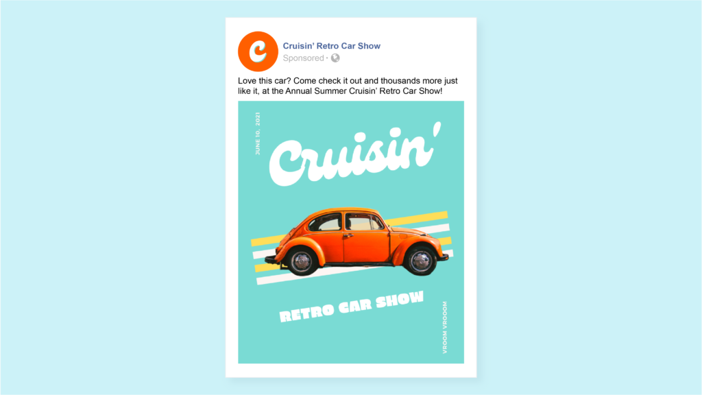
People may not sign up for your event the first time they hear about it, but that’s what an ad series is for. When you have a sequence of image ads that conveys the atmosphere of your event with images that are similar enough to be recognizable — but different enough to provide variety — people find themselves drawn in.
Choose images that convey the personality of your organization and event, so people get to know you over time. A color scheme is an easy way to create that visual consistency. Use elements like T-shirts and banners to choose your colors, then keep re-introducing them in future ads.
Emotional tone helps, too. Think about the atmosphere your event creates, and then choose a group of images that convey what it’s like to be there. That way, each new ad helps your audience to know you and your event better.
Get the Specs Right
Use an image that has dimensions of either 1200 by 628 pixels or 1080 by 1080 pixels. These are the standard recommended sizes for ad images across Facebook’s and Instagram’s properties.
Add Visual Elements
An image isn’t just an image anymore. You can add color, motion, and captions to your ad for an added level of visual interest.

On Facebook, for example, there’s a tool called Create to Convert that lets you add motion elements and even a call-to-action card in just a few seconds. Almost seven out of 10 times, this tool drives better results for brands that use it.
Minimize Image Text
Image text appears directly on the image, not as a caption. “Everyday quality” (text block #3) is the image text in the example below:
“Everyday quality” is the image text here. Note the subtlety.
When it comes to text on image ads, less is more. Facebook routinely analyzes the performance of the ads on its platform, and ads with less image text consistently perform better.
You can cover most of what you need to say in the body copy. We’ll cover that a bit later. But first, it’s time to talk about that magic bullet of engagement — video.
Including Video
Video is captivating. It tells your story in a way that’s authentic and relatable, helping you to forge connections with people who may not have encountered your organization or event before.
Consider these statistics from the 2021 State of Video Marketing report:
- 84% of people have bought something because a video convinced them.
- 69% would like to learn about a service or product by watching a video.
- People watch an average of 2.5 hours of online video per day.
- People are twice as inclined to share online video with friends, compared to any other type of content.
Making a good video is the next best thing to talking directly with audiences. Still, there’s a right way and a wrong way to do it. Again, conciseness is the way to go.
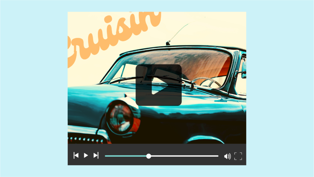
Also, some online event management systems allow you to stream video right in the registration flow, this can be a great way to reuse your social ads video content to inspire more registrations. Keep an eye out for platforms that allow this to also happen on a mobile device’s registration flow.
Create for Mobile
Most people will encounter your ads on their Facebook and Instagram news feeds, which means they’ll probably be casually browsing.
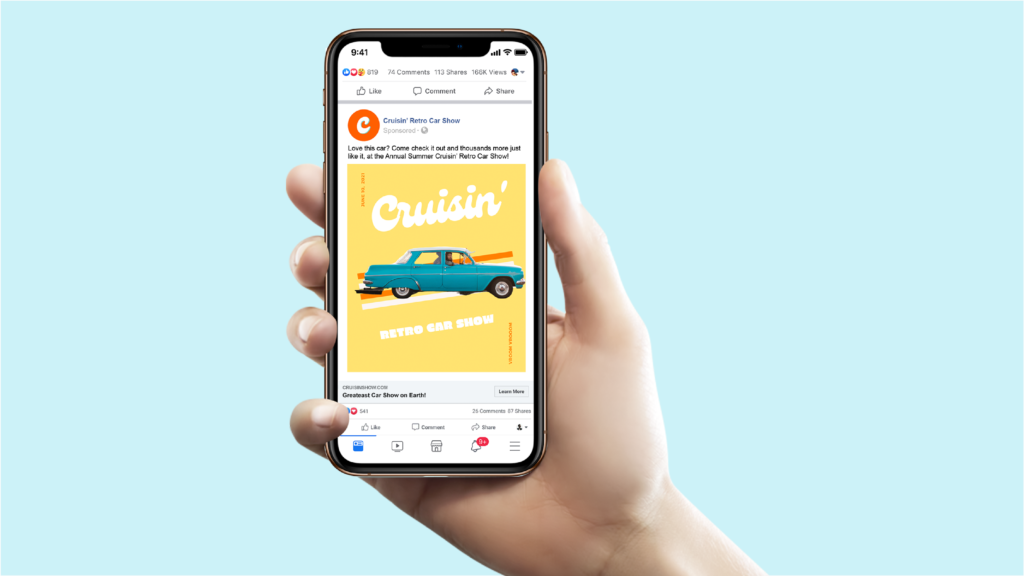
Also, the vast majority of your viewers will be on their phones. Approximately 83% of social media use is mobile. Your videos should be designed for maximum effectiveness in this format.
Keep It Short
Facebook suggests that to maximize mobile interest, videos should be 15 seconds or less. The most exciting part of your video should happen within the first three seconds — about how long it would take someone to scroll past the video if they didn’t feel enticed to stay.
Design for Silence
Facebook also encourages video creators to design for sound-off consumption. Survey data shows that 92% of U.S. consumers watch videos with the sound off on mobile, and 82% watch that way on desktop as well.
Adding captions is an easy and effective way to help your video make sense with the sound off. Plus, 80% of viewers are more likely to finish a video if captions are available.
You can also up the engagement factor in sound-off videos by adding graphics and captions. Strategically placed title cards help people to follow along whether or not they have their captions turned on.
Writing the Copy
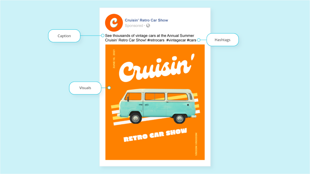
Video and images get people’s attention, but copy seals the deal. There are a few types of ad copy that you need to think about when designing for social media: post text, headlines, link descriptions, and calls to action.
Headlines
Your headline should answer the basic questions that audiences will have about your event when they hear about it for the first time:
- “What’s the name of the event and/or who is playing?”
- “Where is the event located?”
- “When is the event happening?”
Facebook recommends using no more than 40 characters to get the message across. It could be something as simple as:
- Event Name | Venue | Date
- Announcing [Event Name]: Venue, Date
Pro tip: Test out using an emoji or two in your headline to see if it drives more engagements. Emojis can be a great way to convey excitement and even communicate what type of event you’re hosting. Music emojis work great for music festivals, for example.
Post Text
Your post text should also clearly state the event name, where it’s located, and when it happens. Facebook recommends 125 characters for this section, so take advantage and add in some actionable language. Don’t forget to say how to register.
In our experience, second-person text works best. For example:
- “Don’t miss your chance to attend [Event Name] at [Venue] on [Date]!”
- “Bring your whole family to [Event Name] on [Date] at [Venue] for some all-ages fun!”
- “Get your friends together on [Date] at [Venue] for [Event Name}!”
As Instagram says, “Keep it short and sweet.” Or as they say in show business, “Always leave them wanting more.”
Give your audience the important information and let them follow your call to action to go deeper. Check out this example:
Instagram example of great ad text.
Remember, different messaging will resonate with different audiences. Do some A/B testing of different copy variations to find out what wording works best for your crowd.
Link Description
Your event advertising should include a link that people can click to learn more and/or register for your event. On Facebook, you can include that link in your body copy.
Your link description, also known as your anchor text, tells people what action you want them to take and what will happen when they click. For example:
- ”Click here to get your tickets.”
- ”Register today and get your free T-shirt.”
- ”View the schedule and sign up.”
Instagram isn’t structured for body copy as anchor text. Instead, you can:
- Use a link in your bio. (Instagram users know to look for links there.)
- Create a swipe-up Instagram Story ad, where the swiping action takes the audience somewhere.
- Add a call-to-action button to make your post ad clickable.
Every ad should have some kind of call to action (CTA). Whether it’s a button or anchor text, it should be vivid and descriptive.
Call to Action
Both Facebook and Instagram have pre-built CTA buttons with one- or two-word action descriptions. For example, if you want people to buy tickets to your event, you can use the “Buy Tickets” CTA.
(Not seeing that CTA choice in your Facebook Ads manager account? We can help! Email or call us.)
Other actions that perform well for events are “Get Showtimes” and “Book Now” — choose something that speaks to the action you want your audience to take that leads them to the registration page.
Next Steps
By now, you have a solid framework for your Facebook and Instagram event ads design.
Need some more help with your event marketing? Events.com has you covered. Check out our event strategies and marketing solutions, created just for event organizers. They’ll help you generate the buzz you need for a successful event.
