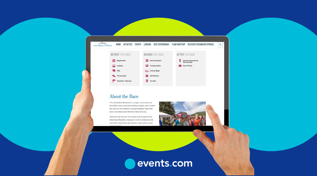
If you’re an event organizer, then you know how important it is to market your event. One of the best ways to host a successful event that people want to attend is by advertising it, and one of the best ways to advertise it is by creating a website for event registration.
An event registration website will build connections and gather useful data. Besides marketing emails and social media posts, an event booking website will be the first interaction your target audience has with your event.
Of course, your event sign-up website has to be built right to be successful. If your website falls flat, then your event might follow suit, and all of your hard work will be for naught. But how do you create a successful website for your event? Keep reading to find out.
10 Tips for Creating a Successful Website for Your Event
Are you ready to create a successful main-event website? Here are a few things you can do to make sure your event website is effective.
1. Understand Your Audience to Provide the Information It Needs
It’s a given — you need to understand the members of your target audience. Who they are, what they care about, and what resonates with them are all questions you need to answer. When you understand your audience, you understand its interests and preferences.
Understanding these key points allows you to cater to your prospective attendees and deliver a more engaging event experience. Doing so will help you build customer loyalty, and your customers will be more likely to return to both your business and any upcoming events you hold.
There are several ways to understand your audience. First, do your research. Look into your competition and learn about its customers. As part of your research phase, you can also conduct surveys and interviews to learn more about your customers on a personal level. Learn about their demographics, such as their age, gender, occupation, geographic location, ethnicity, and religion.
2. Ensure Consistent Branding Throughout Your Website
Inconsistency leads to brand confusion and a poor customer experience. If your brand isn’t consistent, it’ll be harder for your customers to recognize and identify with the company. Your customers may find it harder to trust you, which could impact your sales and return on investment. That’s why you need to ensure your website is consistent across the board.
By now, you probably already have a good idea of what your brand identity is. If not, that’ll be your first step toward building a website with consistent branding. If you have a brand style guide, refer to it as needed in regard to your company’s logo, fonts, colors, and tone of voice. Refer also to your company’s social media accounts to ensure consistency with both the visuals and your messaging.
3. Offer a Great UX Through Which Event Details Are Easy to Find
The best event sites understand that the user experience (UX) is everything. UX is all about ease of use and how users interact with your event website. A general rule for a good UX design is to keep things simple, consistent, and accessible. Your website needs to be accessible to everyone, from the color-blind to those with mobility issues or visual or hearing impairments.
Here are a few tips for creating a great UX for your website:
- Create a website hierarchy to follow for a clean event website design.
- Use clear wording and a clean design on your menus and action buttons.
- Perform usability testing.
- Follow UX/UI design principles.
Don’t forget to listen to your customers! If they report a problem or have a suggestion, work on implementing their feedback.
4. Provide a Seamless Event Registration and Ticketing Process
One of the main goals of your website is to get your audience to register or purchase tickets. Putting an event registration form and a place to purchase tickets on your website gives you the opportunity to convert your audience into potential attendees.
While a long registration form may be tempting, don’t make it convoluted. Remember, simplicity is best, and short registration forms are usually more effective. If the form is long, users might feel like the process will take too much time to complete. Your users might also feel like you’re asking for too much information about them.
5. Use Target Keywords That Your Audience Searches For
How will you attract your target audience to your website? Your best bet is probably through search engines, which means you need to rank high on the search engine results pages (SERPs). Sure, you can post about your website on your social media profiles and even market it through an email campaign, but to attract new people to your event? Search engine optimization (SEO) will be your best friend.
The best way to rank high on the SERPs is through keyword usage. Think about what your audience will search for and how it relates to your event and then use those keywords or phrases strategically throughout your website. Some best practices for keyword usage include thinking like your customers to determine what they might search for, being specific (but not too specific), and being descriptive.
6. Make Your Website Mobile-Friendly
Not everyone has access to a computer, but almost everyone has access to a mobile device. And even those who do have a computer may find it easier to use their phone. After all, it’s easily accessible and often found in your pocket. That’s why your website needs to be mobile-friendly.
The first step in creating a mobile-friendly website is to make it responsive. A responsive website will automatically adjust its width, height, and resolution to the screen it’s viewed from. Make sure your images are optimized for mobile devices, use at least a 14-point font size to ensure readability, and avoid overly large pop-ups that may distract your visitors.
7. Keep Your Site Architecture in Mind at All Times
Your website’s architecture is something you can turn to when you need a structured blueprint for organizing and designing your content.
But it’s not just a sketch — it’s a tangible part of your website. It’s how your webpages are linked together. For example, your event website will llikely have a landing page and then subpages that are linked through a menu. Each subpage can also have additional subpages. That’s your site’s architecture.
This architecture will be the foundation of your website, and it’s what will ultimately make it a success. The end goal is to help users and search engines easily find the page they’re looking for.
8. Include Strong and Appealing Calls to Action
Your website serves a purpose. The purpose is to get your audience to perform an action. What that action is will be up to you, but since you’re an event planner, it will likely have something to do with signing up for your event. Or maybe it’s to subscribe to your newsletter. Either way, your website needs a strong call to action (CTA).
CTAs are meant to persuade your audience by using an encouraging phrase that’s linked to the action you want them to perform. CTAs should be specific. You can’t just use “Click here” or “Submit” as your CTA. Instead, try something like “Reserve my spot.”
Also, be sure to use bright colors to make it stand out.
9. Use Readable Fonts in Appropriate Sizes
Choosing the right fonts and sizes is about more than just aesthetics. It’s also about readability and the user experience. So when you choose your fonts, make sure they’re clean and consistent with your brand. Some of the most popular fonts for website design are Helvetica, Montserrat, and Open Sans. Arial and Calibri are also good options. These fonts appear clear on screens and are easily readable across devices.
Alongside font type, font size is equally important. For mobile devices, choose a 12- to 16-point font size. For tablets, a 15- to 19-point font will work, and for computers, aim for a 16- to 20-point font. By keeping your fonts readable, you contribute to a better user experience, in which your users don’t have to strain their eyes to read your content.
The result? Longer engagement and higher conversion rates.
10. Include Only High-Quality Images
Make sure your website looks professional by using high-quality images. Whether it’s stock photography or your own, the graphics you display across your website are a reflection of your company and your event. If you use low-quality images, you’ll appear unprofessional, and your event may suffer as a result. High-quality images also capture attention more than low-quality images.
When choosing the best images to display, make sure they have a high resolution and are relevant to your event.
Manage Your Event Website and Data Seamlessly With Events.com
Creating the best event site is only half the battle. These 10 web design tips can get you on the right path, but to stay on it, you need a platform you can trust. With Events.com, you can design your own website, promote your event, engage with sponsors, and do much more. Sell and manage tickets, registrations, and merchandise, and tell the world about your event, all through Events.com’s event management platform.
Interested? Great! Try out our demo and see why we’re the best event management software in the business. Let us help make your event day a success.


